Best Wall Art for Small Spaces: How to Make Rooms Feel Bigger with Photography
Introduction: The Small Space Challenge We All Face
Living in a small apartment, condo, or cozy home doesn't mean sacrificing beautiful wall art. In fact, the right photography can actually make your compact spaces feel larger, brighter, and more inviting than you ever thought possible.
I've spent years photographing nature's most breathtaking moments—from frost-covered winter forests to delicate garden roses blooming against dramatic black backgrounds. And one thing I've learned from customers living in everything from studio apartments to tiny bedrooms? Strategic wall art is the secret weapon for making small spaces feel expansive.
Today, I'm sharing the professional tricks interior designers use to maximize space with photography, plus showing you exactly which pieces from The Virtue of God collection work best in compact rooms.
The Psychology of Space: Why Wall Art Actually Matters
Before we dive into specific tips, let's talk about why this works.
Our brains perceive space not just through square footage, but through visual cues:
- Light reflection makes rooms feel open
- Vertical lines draw the eye upward, creating height
- Nature imagery psychologically expands boundaries (our brains associate outdoor scenes with "open space")
- Color temperature affects perceived size (cool blues recede, warm tones advance)
When you choose wall art strategically, you're essentially tricking the eye into seeing more space than physically exists. And nature photography? It's particularly effective because it subconsciously connects your indoor space to the infinite outdoors.
Rule #1: Go Vertical to Create Height
The Mistake: Hanging horizontal art in rooms with low or standard 8-foot ceilings.
The Fix: Choose vertical (portrait orientation) photography that draws the eye upward.
Vertical art creates the illusion of height, making ceilings feel taller and rooms feel less cramped. It's particularly effective in:
- Narrow hallways
- Small bedrooms
- Bathrooms
- Beside windows or doorways
- Compact home offices
Our Recommendation:
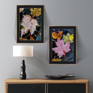
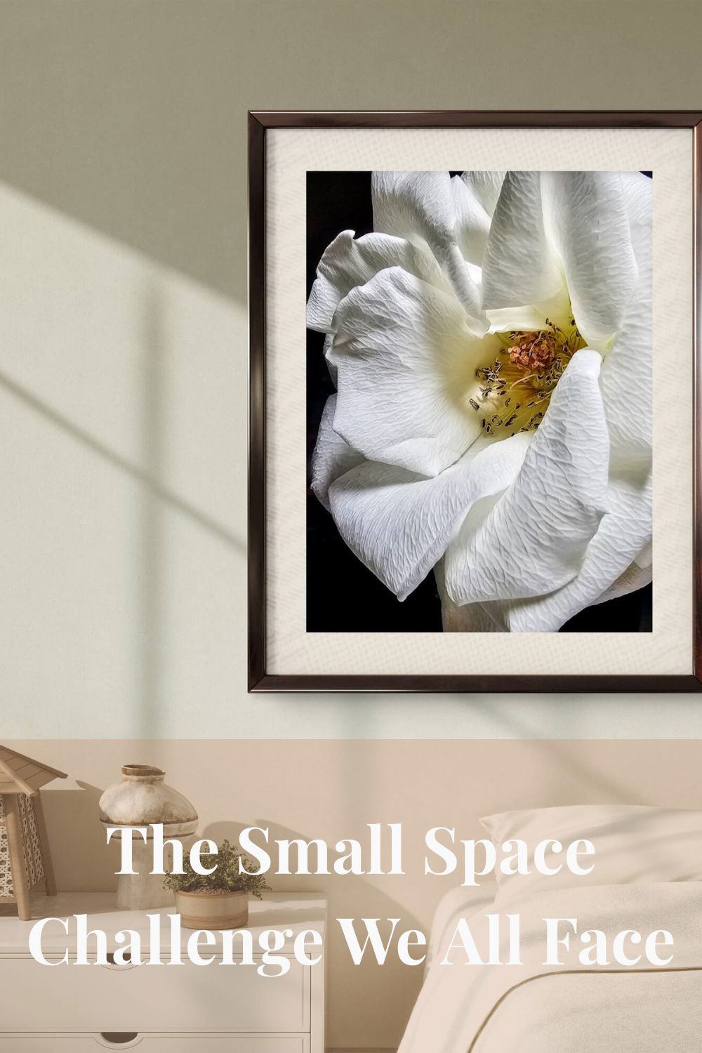
The Bloom of Grace White Rose in the 12x16" framed canvas is perfect for small spaces. The vertical orientation adds height, while the dramatic black background creates depth without visual clutter. The luminous white rose becomes a sophisticated focal point that doesn't overwhelm.

Pro Tip: Hang vertical art slightly higher than eye level (about 60-65 inches from floor to center). This encourages eyes to travel upward, emphasizing ceiling height.
Rule #2: Use Light Colors and Dramatic Contrast
The Mistake: Dark, heavy artwork that absorbs light and makes small rooms feel cave-like.
The Fix: Choose photography with bright, reflective elements or high contrast that creates depth.
Light-colored subjects (like white roses, snowy landscapes, or frost-covered scenes) reflect available light around the room, brightening the space. Meanwhile, dramatic black backgrounds create visual depth—your eye perceives layers rather than a flat wall.
Our Recommendations:
Winter Collection for Light Reflection:
Winter Snowy Forest Sunrise - The brilliant blue sky and pristine white snow literally bounce light around your room. Perfect for north-facing rooms that need brightness.

Winter Frosty Bushes Set - Delicate frost crystals catch and reflect light, adding sparkle without clutter.
High Contrast for Depth:
The Bloom of Grace White Rose - The white-on-black creates dramatic depth that makes walls appear to recede.
Color Psychology Bonus: Cool tones (blues, whites, soft greens) visually recede, making walls feel farther away. Our winter photography naturally incorporates these space-expanding colors.
Rule #3: Choose Panoramic Formats for Width (But Use Wisely)
The Mistake: Trying to fit large horizontal art on narrow walls, creating visual imbalance.
The Fix: Use panoramic horizontal art only above furniture to create visual flow without overwhelming.
Horizontal photography works beautifully in small spaces when positioned correctly:
- Above sofas or beds: Creates width without taking vertical space
- In pairs or groups: Two small horizontal pieces feel more spacious than one large square
- Above low furniture: Console tables, dressers, nightstands
Our Recommendation:
Pink Coral Rose Canvas in 24x12" is the perfect "wide but shallow" format. It creates horizontal flow above a loveseat or full bed without eating up precious wall height. The joyful coral tones add warmth while the panoramic format makes furniture arrangements feel more intentional and spacious.

Pro Tip: In really tiny rooms, go with the 24x12" size maximum. Larger panoramic formats (32x16"+) can overwhelm compact spaces.
Rule #4: Embrace "Less is More" with Single Statement Pieces
The Mistake: Covering every wall with multiple small frames, creating visual chaos.
The Fix: Choose ONE stunning, high-quality photograph as a focal point.
Small spaces can't handle gallery wall clutter. Instead, invest in a single piece of photography that:
- Draws the eye to one intentional spot
- Creates a "rest point" for the visual field
- Establishes sophistication through restraint
The "One Perfect Piece" Approach:
Think of your wall art like jewelry. Would you wear 12 costume necklaces or one elegant statement piece? Same principle.
Our Recommendations by Room:
Small Bedroom:
Spring Yellow Succulent Canvas (12x16" wrapped) above the headboard. Pale yellow-greenish blossom creates a calming focal point without competing for attention.

Tiny Living Room:
Winter Trees and Moon (16x24" single print) above the sofa. The vertical forest scene adds height while the cool tones expand perceived space.
Compact Home Office:
Pink Rose on Rainy Day (20x16") above your desk. Horizontal format creates width, warm tones boost creativity, and it doesn't overwhelm a small workspace.
Rule #5: Leverage Biophilic Design to "Bring the Outdoors In"
The Mistake: Ignoring the psychological power of nature imagery.
The Fix: Use authentic nature photography to create the illusion of windows and outdoor views.
Here's the magic: Our brains don't fully distinguish between a photograph of nature and an actual view of nature. Both activate the same neural pathways that:
- Reduce stress and cortisol levels
- Create feelings of spaciousness
- Improve mood and focus
When you hang a forest photograph in a small room, your subconscious perceives it as a "window" to the outdoors. Suddenly, that cramped bedroom feels connected to something infinite.
Biophilic Photography for Small Spaces:
Forest Scenes = Depth Perception:
Winter Forest in Twilight - The layered trees create visual depth that makes walls feel farther away.

Macro Details = Meditative Focus:
Winter Frosty Bushes - Close-up frost patterns invite contemplation without overwhelming. Small details feel intimate rather than cramped.
Garden Flowers = Organic Warmth:
White Arum Lily - The natural garden setting (not sterile studio!) creates a subconscious connection to outdoor spaces.
Research Backs This Up: Studies show that even viewing photographs of nature can reduce stress by up to 60% and improve cognitive function—benefits that are especially important in small spaces where we might feel confined.
Rule #6: Consider Scale Carefully
The Mistake: Going too small (timid art gets lost) or too large (overwhelming the room).
The Fix: Follow the "2/3 to 3/4 Rule" for furniture placement.
The Formula:
- Measure the width of your furniture (sofa, bed, dresser)
- Choose art that's 2/3 to 3/4 that width
- Hang 6-8 inches above the furniture
Examples:
Full Bed (54" wide headboard):
- Perfect: 12x16" vertical (12" wide) or 24x12" horizontal (24" wide)
- Too small: 8x10" gets lost
- Too large: 32x16" overwhelms
Loveseat (60" wide):
- Perfect: 24x12" or 32x16" horizontal
- Alternative: Two 12x16" verticals side-by-side with 3" gap
Narrow Hallway (36" wide wall):
- Perfect: 12x16" or 9x12" vertical
- Too wide: 24x12" horizontal bumps against edges
Pro Designer Trick: When in doubt, go slightly smaller rather than larger. In small spaces, breathing room around art actually makes the room feel bigger.
Rule #7: Use Frames Strategically (Or Go Frameless)
The Mistake: Chunky, ornate frames that add visual weight.
The Fix: Choose slim black frames or frameless gallery-wrapped canvases.
Framed vs. Frameless in Small Spaces:
Black Frames (Slim Profile):
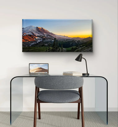
Mt. Rainier Sunset at Reflection Lake - The 1.25" black pine frame is substantial enough to feel finished but slim enough not to dominate. Black frames also "recede" visually, especially against white or light-colored walls.

Frameless Gallery-Wrapped:
The 1.25" gallery wrap creates a modern, floating effect. No frame means no visual "border" confining the space—the image just exists on the wall, which feels less cluttered.
Avoid:
- Thick ornate frames (2"+ with decorative elements)
- White frames on white walls (they disappear but the artwork floats awkwardly)
- Multiple frame colors in one small room (visual chaos)
Best Practice: Stick to ONE frame style throughout a small space. All black frames, OR all frameless gallery wraps. Consistency creates calm.
Rule #8: Placement Height Matters More Than You Think
The Mistake: Hanging art at random heights, creating visual disorganization.
The Fix: Use the "57-60 inch rule" for gallery-level hanging.
Standard Heights:
Above Furniture:
- Hang 6-8 inches above the top of headboards, sofas, dressers
- Artwork and furniture should feel visually connected, not floating separately
On Open Walls (no furniture below):
- Center of artwork at 57-60 inches from floor (standard gallery height)
- Exception: If you're taller/shorter than average, adjust for YOUR eye level
Small Space Bonus Trick: Hang vertical art slightly HIGHER than standard (62-65 inches to center). This draws eyes upward, emphasizing ceiling height and making the room feel taller.
Installation Tip for Renters: Use Command Picture Hanging Strips for smaller pieces (up to 12x16"). For larger sizes or heavier framed canvases, invest in proper drywall anchors—they're removable and patchable when you move.
Rule #9: Maximize Natural Light Reflection
The Mistake: Placing art on walls opposite windows where it becomes backlit and shadowy.
The Fix: Hang art on the SAME wall as windows or on adjacent walls where natural light hits it directly.
Light Direction Strategy:
Winter Photography (Our Specialty): Because our winter collections feature lots of white (snow, frost, white roses), they're incredibly effective at bouncing natural light around a room.
Best Placement:
- Walls perpendicular to windows: Light streams across the art, illuminating details
- Walls opposite doorways: Art catches light from hallways/adjacent rooms
- Above light-colored furniture: Furniture + light art = double reflection
Avoid:
- Walls directly opposite windows (art appears dark, backlit)
- Corners that never get direct light (wasted opportunity)
Small Space Lighting Hack: If you have a north-facing room (notoriously dim), choose our Winter Snowy Forest Sunrise. The bright blue sky and white snow act like a secondary light source, Winter Snowy Forest Sunrise
psychologically brightening the entire space.
Rule #10: Tell a Story (Keep It Simple)
The Mistake: Random, unrelated art that creates visual confusion.
The Fix: Choose ONE theme or story that unifies your small space.
In compact rooms, thematic consistency makes spaces feel intentional rather than haphazard.
Theme Ideas for Small Spaces:
Winter Serenity: Use our Winter Frozen Collection throughout. The cohesive color palette (blues, whites, grays, golds) creates visual flow from room to room. Perfect for creating a calm, Scandinavian-inspired aesthetic.
Garden Sanctuary: Pair Yellow Rose with Purple Rose for a "rose garden" theme. One vertical (bedroom), one horizontal (living room). Different colors, same botanical elegance.
Minimalist Nature: Choose all frameless gallery wraps in a monochromatic palette (all whites and blacks, OR all warm corals and greens). Less is more.
Pro Tip: In very small spaces (studio apartments, tiny homes), use the SAME photograph in multiple sizes across different rooms. This creates continuity that makes the space feel larger and more cohesive.
The Virtue of God Small Space Collection: Our Top Picks
After years of working with customers in small homes, here are the pieces that consistently perform best:
Best for Tiny Bedrooms:
The Bloom of Grace White Rose - 12x16" Framed Canvas
- Vertical orientation maximizes height
- Black frame adds sophistication without bulk
- White rose reflects light
- Story adds emotional depth to intimate spaces
- Size is perfect above nightstands or narrow walls
Best for Small Living Rooms:
Winter Snowy Forest Sunrise - 16x20" Single Print
- Vertical format doesn't steal wall width
- Cool blues visually recede (makes walls feel farther)
- Forest depth creates "window to outdoors" effect
- Bright whites bounce light around room
Best for Compact Home Offices:
Pink Coral Rose - 24x12" Gallery-Wrapped Canvas
- Horizontal format creates width without height
- Warm coral tones boost creativity and energy
- Panoramic size fits perfectly above desks
- Frameless = modern, uncluttered aesthetic
Best for Narrow Hallways:
Winter Frosty Bushes - 8x12" or 12x18" Single Print
- Small enough not to overwhelm narrow spaces
- Macro details invite closer viewing (perfect for hallways where people walk past slowly)
- Vertical orientation doesn't bump into doors or light switches
- Set of 4 can be staggered down the hallway for flow
Best for Bathrooms (Powder Rooms):
- Smallest framed size perfect for compact powder rooms
- Black frame = sophistication
- White rose = spa-like serenity
- Story creates conversation piece for guests
Real Customer Transformations: Small Space Success Stories
Sarah, Studio Apartment in Seattle: "I was terrified to put anything on my walls because my studio is only 450 square feet. I thought art would make it feel even smaller. But the 12x16" Bloom of Grace white rose above my bed actually makes my sleeping area feel like a separate 'room'! The vertical format draws my eye up, and I swear my ceilings look taller. Plus, waking up to that story every morning reminds me that even in my tiny space, beautiful things can bloom."
Marcus, Small Home Office: "Work-from-home in a 10x10 office was making me claustrophobic. I ordered the Pink Coral Rose in 24x12" to go above my monitor. The horizontal format made my desk wall feel wider, and the warm colors actually help me focus. Clients comment on it during Zoom calls too—much better than a blank wall!"
Elena, Narrow Hallway: "Our hallway is 3 feet wide and felt like a dark tunnel. I hung three of the Winter Frosty Bushes prints vertically down the length, staggered at different heights. Now it feels like a curated gallery space instead of a claustrophobic corridor. The white frost reflects light from the living room, and people actually stop to look at the details instead of rushing through."
Common Small Space Mistakes to Avoid
❌ Mistake #1: Gallery Wall Overload Multiple small frames create visual clutter. In small spaces, clutter = cramped feeling.
✅ Fix: One impactful piece > ten tiny ones.
❌ Mistake #2: Ignoring Orientation Horizontal art in vertical spaces (or vice versa) fights the room's natural proportions.
✅ Fix: Match art orientation to wall shape.
❌ Mistake #3: Dark, Heavy Subjects Dense forests, dark abstracts, or heavy colors absorb light.
✅ Fix: Choose high-contrast or light-reflective photography.
❌ Mistake #4: Wrong Size for Furniture Art that's too small floats awkwardly; too large overwhelms.
✅ Fix: Follow the 2/3 to 3/4 furniture width rule.
❌ Mistake #5: Forgetting the 6-8" Gap Art hung directly against furniture top feels cramped.
✅ Fix: Always leave breathing room between furniture and art.
Quick Reference Guide: Small Space Wall Art by Room
|
Room |
Best Orientation |
Ideal Size |
Our Recommendation |
|---|---|---|---|
|
Studio Apartment |
Vertical |
12x16" - 16x20" |
|
|
Small Bedroom |
Vertical |
12x16" - 18x24" |
|
|
Tiny Living Room |
Vertical or Horizontal (above sofa) |
16x20" vertical or 24x12" horizontal |
|
|
Compact Home Office |
Horizontal |
24x12" |
|
|
Narrow Hallway |
Vertical |
8x12" - 12x16" |
|
|
Bathroom/Powder Room |
Vertical |
9x12" - 12x16" |
Final Thoughts: Small Spaces, Big Impact
Living in a small space doesn't mean sacrificing beauty or style—it just means being more intentional about what you hang on your walls.
The right nature photography can:
✨ Make ceilings feel taller
✨ Create the illusion of depth
✨ Reflect light to brighten dim rooms
✨ Connect your indoor space to the infinite outdoors
✨ Tell a meaningful story that adds emotional spaciousness
Every photograph in The Virtue of God collection is captured with intention—from the frost-covered forests of winter mornings to the resilient rose that bloomed twice in my own garden. These aren't just pretty pictures. They're moments of grace, preserved forever, ready to transform your small space into something that feels expansive, serene, and uniquely yours.
Ready to make your small space feel bigger?
📸 Explore The Virtue of God Collection
Still not sure which piece is right for your space? Email us directly at info@thevirtueofgodbrand.com with your room dimensions and a photo—I'd love to help you choose the perfect piece.
Because every space—no matter how small—deserves to feel like a sanctuary.
—Martha Solo
Photographer & Founder, The Virtue of God